#VIEWPOINTS: HOW I DESIGNED OPEN TV
HOW I DESIGNED OPEN TV
We are all designers.
During my time in University I was introduced to the Austrian, gadfly designer and educator Victor Papanek. Throughout the course of his work he explained “the only important thing about design is how it relates to people.” Good design has the power to change the world but I strongly believe that great design has the ability to encourage action.
We spend a majority of our lives sifting through content, constantly searching for meaningful ways to connect with others who share our values and ambitions. I take pride in sustaining human interaction through multilayered initiatives that inspire us to dig a little deeper and ask the important questions that are often silenced. Over the course of my career I have dedicated myself to a handful of empowering projects that allow me to help people create, organize and sustain their digital presence.

As our society continues to evolve and we collectively learn how to integrate new media into our everyday lives I'm honored to be in a position to chime in on the conversation. One component that inspired me to get involved with Open TV was the unparalleled perspective of what it means to motivate and sustain underrepresented arts and artists in the digital age.
Since I see the world through a strategic design lens I think that problems are pleasant opportunities waiting to be discovered. Aymar Jean Christian, the creator of Open TV approached me with a specific design problem in the late fall of 2014. As I reference my notes from the brief phone call I instantly remember resonating with a particular question that he posed: "How can we build a television network that is completely open, yet sustainable?" I've always harvested the unique ability to recognize relationships and make connections but I found a distinct challenge while trying to uncover the unique opportunity in Christian's problem.
This lead me to revisit my various notions of design and its cultural purpose in our current social climate. Let me be clear, I don't believe and or conform to labels. More importantly, I do not identify as a designer but I am convinced, as Lorraine Wild would say, that "you have to be interested in culture to design for it." I began to dig deep into the questions posed by some of the greatest designers that I know, and even a few that I wasn't aware of. My results weren't staggering or even that inspiring. They were honest. At there core, they were concise. Design is a strategic way of thinking and approaching complex situations.


After four years of University, three years of consulting and countless numbers of successful discoveries, Open TV made me realize that the power of design isn't just the link in a chain but is the hub a wheel.
Beyond developing my eye for good design, the skill of deconstructing a situation, thinking through solutions and then using critical analysis to discover opportunities has been one of my greatest assets on the development team of Open TV. In short, we're moving into an age where we are all designers, some of us are just a bit more fortunate to be able to do it full-time. As Chris Pullman eloquently describes, “Design is not the narrow application of formal skills, it is a way of thinking.” Go forth. Start thinking about your legacy. And always make objects and moments that are meaningful.
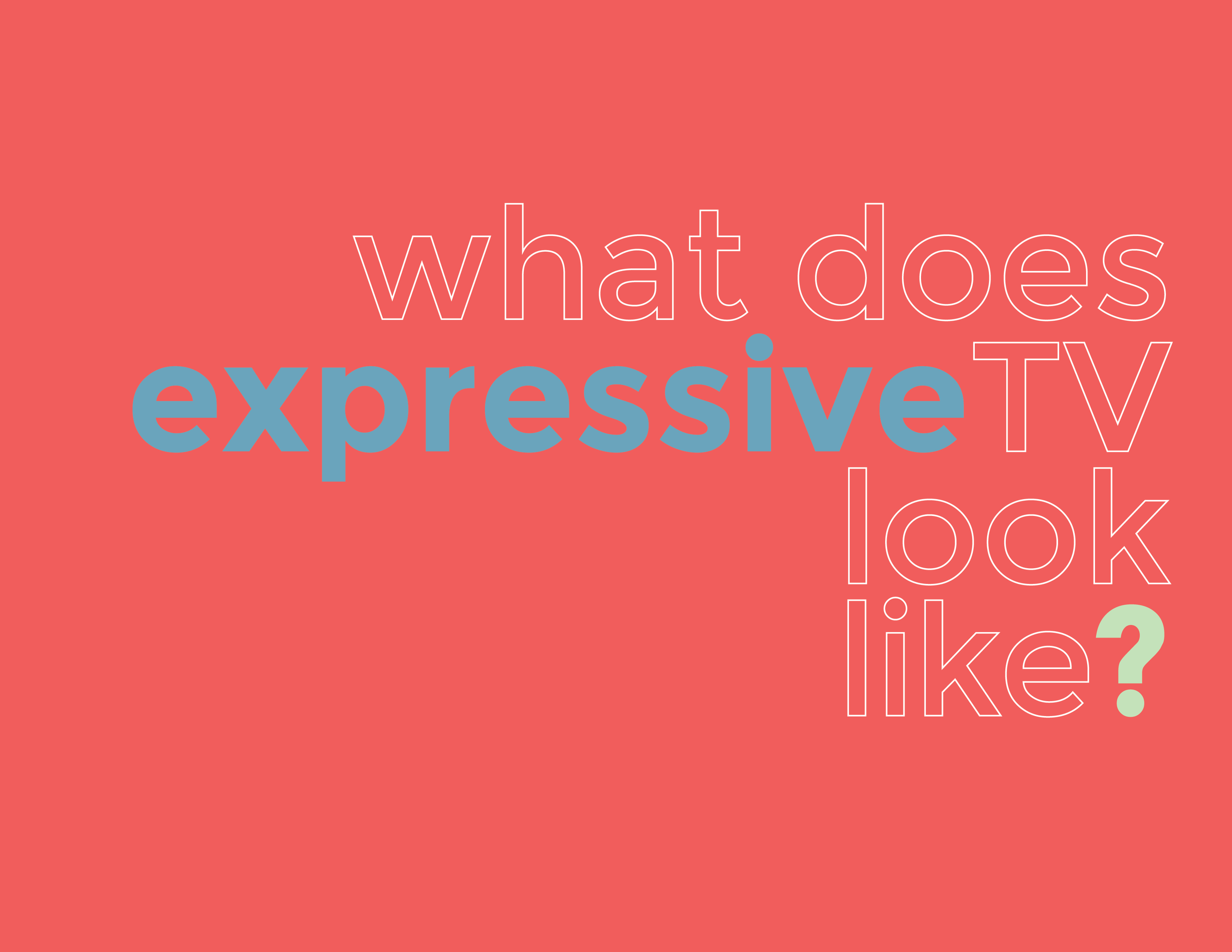
In the meantime, connect with the brief outline below that details some of my aesthetic choices, inspirations and modes of thinking as I designed the Open TV platform.
I draw inspiration from the world around me: nature, human interaction and cultural practices. Whether I'm designing a website or sketching for a personal, creative project I begin with a simple question: What is the value of this object or moment? From there I begin to think about the end user or viewers needs, desires and concerns. As I started to design the Open TV platform there were three specific projects that I drew inspiration from: Creative Mornings, Invitation/Annual and MakeShift Society.
INSPIRATION:

Creative Mornings is a monthly breakfast series that features a twenty minute talk from an individual in the creative community. Started in Brooklyn, New York, the gathering has expanded its community to over 100 chapter across the world in cities such as Chicago, Montreal, Berlin and Barcelona.
What I enjoy most about the online platform is that it is highly integrated, yet still remains simple and consistent across their global reach. Although the Creative Mornings is structured, there is still something very fluid and whimsical about the way they publish content.

Invitation/Annual was platform where creative people get to be people. What began as a quarterly magazine evolved into a global community of artists rooted in co-creation and resource sharing. As I designed the Open TV platform I wanted to make sure that all levels of development and production always remained transparent. Seeing as the the platform is still in beta I wanted the design of the platform to entice a large community of creatives to not only join the conversation but help shape the narrative.
The creative team behind the publication presented all large decision to their community before acting and are known for constantly encouraging feedback in all stages of development. This was usually engineered and promoted through new media, touch points and word-of-mouth.

MakeShift Society is a co-working facility and community located in San Francisco, California and Brooklyn, New York. I must admit, I tend to draw a lot of inspiration from the design of this platform for it's clear and concise mission to make life easier for freelancers and small teams to start and grow their businesses. Rooted in resource sharing they have been able to integrate the creative judo that is well and alive in their spaces on to their online platform. This is something that I find to be incredibly difficult design challenge.
While designing the Open TV platform I drew specific inspiration of the tone and energy that should be established on an offline. As an art institution in the digital age, I believe it is important to have a consistent message that is searching for news ways to translate value and build solidarity.
IDENTITY

While designing the Open TV identity I drew specific inspiration from the "Please Stand By" broadcast. This image was developed by Sony and would be used during technical difficulties as well as censorship purposes. The image would be displayed on a television screen followed by a high-tuned buzzing. In addition to this I also was motivated by the world intervention, a word that Christian uses to describe the intersection occurring between television, film, online video, art practices and industries.
Instead of selecting overwhelming colors that tend to alarm or agitate I incorporated tones that were inviting and inclusive. The trick was selecting the perfect hue that still accurately represented the RGB color model.

Persimmon Red
Red is the color of fire and blood, so it is associated with energy, war, danger, strength, power, determination as well as passion, desire, and love.
Red is a very emotionally charged color. It is known to enhance human metabolism, increase respiration rate, and raises blood pressure. The color red has high visibility, which is why stop signs, stoplights, and fire equipment are usually painted red. Heraldry speaking, red is used to indicate courage which explains why it is a color found in many national flags.
From a design perspective, red brings text and images to the foreground. When it is used as an accent color it has been proven to stimulate people to make quick decisions. The common characteristics of light red represents joy, sexuality, passion, sensitivity, and love.
The #OpenTVOriginals vertical is red because it presents a stronger more cohesive statement, similar to a well developed series of episodes.

Madang Greene
Green is the color that often used to depict nature. It symbolizes growth, harmony, freshness, and fertility. The color often has a strong emotional correspondence with safety and is also commonly associated with prosperity.
There are very powerful healing characteristics that the color green has since it is commonly found in natural elements. Although green suggests stability and endurance it also can denote a lack of experience; for example, a 'greenhorn' is a novice. Green, as opposed to red, means safety; it is the color of free passage in road traffic and is generally used to showcase growth and hope.
The common characteristics of Jade green represents trust and confidentiality, tact and diplomacy. It is often used to display a generous spirit, or a giving without expecting anything in return. Not only does it increase worldly wisdom and understanding it has been know to assist with the search for enlightenment.
The #OpenTVPresents vertical is green because it is natural and fertile, similar to good pilots.

Moonstone Blue
Blue is a color that is often associated with depth and stability. It symbolizes trust, loyalty, wisdom, confidence, intelligence, faith, truth, and the great divine.
The color blue is considered beneficial to the mind and body. It has been proven to slow down human metabolism and produces a calming effect which is why it is often used in tranquil, calm envirnoments.
There is something quite sincere about the color blue when relating to emotions seeing as it relates to cleanliness and consciousness. As opposed to the emotionally warm colors of red, orange, and yellow; blue is linked to consciousness and intellect. The use of of light blue represents precision, health, healing, tranquility, understanding, and softness.
The #OpenTVCommunity is blue because it represents stability which is symbolic of a sustainable environment.
As for the design of the logo, I was encourged to create something modern and highly technical. I drew specific inspiration from typefaces that were symmetrically balanced. There also needed to a certain flexibility in the style that would increase the response to Open TV's call to action.
CHANNELS
We often overlook communication as a part of design but I strongly believe that linguist is an art form in itself. While designing the Open TV identity I made sure to think about the channels that would be used to promote the platform's tone, image and most importantly, value.
Facebook - used to promote general updates, events, and forward traffic to the official website of Open TV.
posting schedule: 1-4pm and 2-5pm on weekdays
voice and tone: down-to-earth and informative
Instagram - used to promote all visual content, branded content and forward traffic to the website that adhere to style guidelines.
positing schedule: 5-6pm on weekdays
voice and tone: humorous and straightforward
Twitter - used to inform a larger audience of creatives on call to actions, current happenings in free flowing, unstructured manner.
posting schedule : 8-11am and 1-4 pm on weekdays
voice and tone: upbeat and sassy
Vimeo - used exclusively to host all video based content
posting schedule: unstructured, typically updated monthly
voice and tone: straightforward and informative
As you can tell, I love of strategy. Love and care went into the development and design of the Open TV platform. If you're craving more information, check out the official six chapter story here.
Written by Elijah McKinnon, Head of Marketing and Design for Open TV